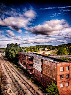
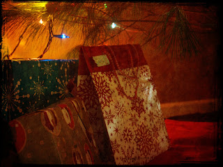
The polaroid transfer has an old-timey look with rough borders. The rough border comes from the ink that gets peeled off when the image is transfered. Both of these photos were just photos from around my house of the christmas decorations and presents. In the second picture the mimic is more obvious than in the first. In the second one the whites take ona brownish spotted look that is a characteristic of polaroid transfers.
Tuesday, December 18, 2012
Friday, December 7, 2012
Digital Assignment #7: Cross Process Mimic
This is another project that mimics a film technique. Cross processing is when we develop film in a different developer than it's meant for and this alters the colors. Digitally we can alter the colors of a photograph and you can get a warmer of cooler affect from this color shift. m first photo I shifted to have a warmer look. The second one is a little of a mix but slightly towards the cooler side.
Digital Assignment #6: Glass Plate Mimic
This assignment is a mimic of a film project. With the film you would create a polaroid and peel the image away from the backing and then transfer it on to a glass plate. You can get the same look digitally by overlapping the photo with an old-time border. I then changed the picture to make them black and white or sepia.
Thursday, December 6, 2012
Digital Assignment #5: Carter Mountain
When we went to Carter Mountain we had to tell a story with ten photos. So I went up with my family and photographed my brothers' experience. We also had to take seven additional photos that contained different elemements of photography. Carter Mountain is a nice place to take photos at because there is so much you can use to change up each picture.
Creative Portrait
Lines
Motion Blur
Rule of Thirds
Short Depth of Field
Stop Action
Wide Depth of Field
Story 1
Story 2
Story 3
Story 4
Story 5
Story 6
Story 7
Story 8
Story 9
Story 10
Roll #7: Hand Coloring
Hand coloring is another one of my favorite projects, the oils are fun to work with and you can bring out any part of the photo you want to. Both of these photos I took at home. I went outside to see my neighbor's puppies and took my camera with me. I knew I was taking pictures for hand coloring and tried to get the puppies to play on the slide or with their balls. I then moved on to photograph my goats and photographed toffee with the gate because it would add an aspect to color and framing.
Aperture: f/5.6
Exposure time: 5 seconds
Aperture: f/5.6
Exposure Time: 3seconds
Aperture:f/5.6
Exposure Time: 2.5 seconds
Tuesday, November 27, 2012
Roll # 6: Solarization
Solarization is one of my favorite projects. The outcome is a neat look. In solarization you expose a photo twice. The first exposure you adjust as you normally would for contrast, you then begin to develop it but then re-expose it to light getting the effect below. The first photo of my sister and the dandelion I hadn't taken for my solarization roll but when I began to think what I wanted to solarize I thought that it would make a good print. The second photo didn't turn out as well as I had hoped but I like the lens against the leaves and the rock.
Contact Sheet
Aperture: f/5.6
Exposure Time: 5 seconds
Dandelion
Aperture: f/5.6
Exposure Time 1: 6 seconds
Exposure Time 2: 6 seconds
Camera Lens
Aperture: f/5.6
Exposure Time 1: 12 seconds with Filter #4
Exposure Time 2: 12 seconds
Thursday, October 25, 2012
Digital Assignment #4: Proportions
This assignment was a fiarly simple one. We took photos thinking of how they would look with different proportions then the normal that you get from the camera. With the first photo I decided to crop it to the 6 x 17 because I wanted the focus to be Paige. I like how these proportions keep her framed and the center of attention. In the second picture I chose the proportions 16 x 9 to make the picture tall and less wide. The crop allowed the unecessary stuff on the outsides to be cut out and to have the puppies the center fo interest.
6 x 17
16 x 9
Digital Assignment # 3: Sepia
One day I went out and decided to have a photo shoot with my goats. I spent some time following them around and snaping photos of them playing. When I was figuring out what pictures I wanted to use for my sepia I saw this one and thought it would go well with the sepia tones. The wood and the goat seemed to go well with the tones.
When I was at Virginia Beach my sister, Paige, and I decided to take a bunch of random pictures of each other. I liked this picture when I converted it to sepia because the sand goes well with the sepia look.
Digital Assignment #2: HDR Merge
For this assignment I chose to go Downtown for a change of scenery from my house. For these photos we had to take muliple photos of the same scene at multiple exposures. Then we merged them through a program on the computer leaving us with a cool balance that allows us to see areas that were in shadow and those that were in the light. I then played aroud with the photos some enhancing color and changing things as I wanted.

Railroad Tracks
The General
Roll #4: Layers
Contact Sheet
Aperture: f/5.6
Time:5 seconds
I took my layers roll at home. My goats were out running around and I thought that there actions could make some interestin photos with layers.
Kenai
Aperture: f/5.6
Time: 2 seconds
I snapped this photo because I thought all the stuff on the porch with my dog would make some good layers. I am happy that I was able to get this picture since she is not too fond of cameras.
Wilfred & Miriam
Aperture: f/5.6
Time: 1.5 seconds
The fact that my brother happened to be sitting on the back of the car at this time was great. With him there it adds another layer that wouldn't be there normally.
Tuesday, October 23, 2012
Roll 3: 3200 Film
Contact Sheet
Aperture: f/5.6
Time: 5 seconds
I was in Virginia Beach the weekend that I was shooting with the 3200 film. This worked out really well because the water goes really well with the grain of 3200 film.
The Race
Aperture:f/11
Time: 4 seconds + 2 seconds in the sky
Filter: #3
When I looked at my negatives I liked how this picture looked and decided to print it. I like the C- curve that the water and the buildings help create taking your attention to Jesse.
Walk at the Beach
Aperture: f/11
Time: 19 seconds
Filter: #4
I like this photo because even though there is a lot of sky the bottom of the picture goes well with the grainy look. I like the line of the water and buildings that goes off into the horizon.
Roll 2: Sepia Toning & Black and White on Fiber Paper
Contact Sheet
Aperture: f/5.6
Time: 5 seconds
While in Brazil this summer I took some film photos. I chose to use some of them to tone sepia and to print on fiber paper.
Aperture: f/5.6
Time: 2.5 seconds
As I traveled down the river in Brazil I enjoyed taking some scenery shots. When I saw this photo I thougt that it would tone sepia really well.
Aperture: f/5.6
Time: 5 seconds
This photo I took because I liked the look of the canoe and the different actions of the kids. I chose to tone it sepia because when there are lighter tones in the photo it tones better.
Aperture: f/8
Time: 8 seconds
With this photo I was trying to frame the boat in between my boats rails.
Aperture: f/8
Time: 4 seconds
I liked this photo because the kids were framed by the sides of the brick church and the edge of some benches.
Roll 1: Free Shoot
Contact Sheet
Aperture: f/5.6
Time: 5 seconds
I took all of these photos while I was in Tennesse helping my sister move into her college dorm.
Paige
Aperture: f/5.6
Time:67 seconds
I chose this photo of my sister because I liked how I could use the bench as a leading line to draw the attention to Paige.
Seeing Double
Aperture: f/5.6
Time:14 seconds
For this photo I decided to play around a little. There were these two drain pipes next to each other and I took two photos. I kept the camera in the same postion for both photos and then overlapped the negatives in the darkroom to have Paige show up in both sides of the drains.
Monday, October 1, 2012
Digital Assignment 1: Cubism
This photo I caught by chance. I was watching my goats and had my camera nearby. I knew I was shooting for the cubism assignment and thought their fence would be great for it. When they turned I grabed my camera because both of their faces were framed within the cubism aspect I was trying to use.
Subscribe to:
Comments (Atom)


